
I won’t bore you to death too much about how the Dow Theory works. I just want to take a couple of pages to explain to you a theory that has a degree of influence on the spread trades that I make.
The Dow Theory has been around over a 100 years or more now but still today this theory is still being used by many Fund Managers, investors and the like around the world. So it deserves some lip service at the very least.
When the Dow Theory was first developed it wasn’t and still isn’t designed for single stock evaluation. It was designed primarily to work with a collection of stocks, such as those found in Indices or Sectors. Although, some of the theories that I use can be used for single stock evaluation. Hope that doesn’t confuse you there.
Charles Dow developed the Dow Theory, not so much as a book or anything as far as a paper. He wrote for The Wall Street Journal and spent many years developing his own theories that forecast on the basis of the movements of a selected group of stocks. These were sent as editorial for The Wall Street Journal. It was these fragments, which built up over time and were later brought together by William Hamilton, that represent the theory as it is known today.
Now I won’t go in depth on the Dow Theory as our trusty computers process the main tools that we use to signal price movement. The main areas of the Dow theory that you should be aware are those of the following, and this is the only part of the Dow Theory that I use. So don’t bother boring yourself to death by buying a book on it. Save your money and your time.
Primary Trend:
The current state of the company as far as everything is concerned; be it news, profit warning, dividend pay-outs is reflected in the chart already. In other words, what you see in front of you, is the current standing of the company in relation to expectation and the markets. Sounds obvious, but we already know that what we see is not necessarily the real value of the company. What Charles Dow is saying, is that the current chart that we see is how the market has averaged out where the company stands in terms of it attractiveness to being traded bought/sold – that everything has been taken into consideration.
Now there maybe blips caused by so called secondary trends, but the overall trend – the primary trend, is the trend that can’t be easily manipulated by fair means or foul. My saying is “In the end the price will follow the trend,” or there’s another more popular one “Let the Trend be your friend,” – by that we mean that trading long term against a trend is hazardous.
Another thing Dow noticed was that when a company announced ‘Good News,’ the share price dropped. Surely good news would create buying of that stock not selling? This reaction to use am example, proves Dow’s theory a little more, in that charts reflect the current state of that share’s attractiveness to buy/sell, with everything considered in the price.
So what is happening is that the News has ALREADY been accounted for in the share chart. By the time the news has hit the public, the chart has already reacted and moved on. Hence another saying ‘Buy the Rumor & Sell the News’.
In fact I have been burnt when I first started trading by not taking heed of the above advice. I ended up buying the news and lost a lot of money. Thankfully, you won’t be making the same mistakes, as I’ve since learned my lesson.
Therefore if you’re trading long term 3 months or more follow the primary trend or at least be aware of it. Hence our initial assessment of the charts and placing them into certain categories.
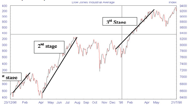
I would now like to give you an idea of how trends work with Bullish (Rising) and Bearish (Falling) markets. The Dow theory suggests that there are three stages in both a Bullish and Bearish market.
Once again, I have put this here for your own reference. You won’t have to worry too much about spotting these trends within the markets. The tools that you will be using will do a great deal of the hard work for you. The rest is a matter of training your eye to look for key signals that point to price movements.
Rising Markets:
There are three stages that the market goes through:
Stage 1: Accumulation: This is where the prices have hit rock bottom. Either through a stock market crash or something as devastating such as a depression or recession. Few have money to invest and most are not keen after having their fingers burnt from a plummeting market.
What happens next is that the people with money, such as large private investors and institutions (banks etc.) start buying into the markets again. They see good value and are one of the few left to have the resources and the confidence to start putting money back in the markets.
You can spot this by an increase in Volume, the amount of shares bought or sold – these are shown at the bottom of a chart; go back to the charts at the very beginning of this course and you will see the volume at the bottom of some of the graphs.
There won’t be a surge in the price, but volume will show a marked increase.
Stage 2: Moving on Up: This is one of the longest periods on a Rising market. It is when prices will begin to rise substantially. This is usually because general business confidence is increasing and therefore a more marked increase in stock purchase arises.
A tremendous period to make money during a trending market. Easy to spot by further rises in volume, but more so by the obvious hike in prices over the longer term.
Stage 3: Excess: This is when the public become involved in the markets, as ever they are the last to know. Speculation leads to increased highs in the charts. This is the final stage in a rising bear market.
Once again this is easy to spot as the chart is peaking and rising sharper than at any other point. Money can be made here, but the top of the market isn’t very far away.
With a bit of imagination you can see a rising market such as this, as if they were 3 steps on a staircase. The first step quite shallow and rising slowing, a few months long, the next step (moving on up) is longer but much higher, the third and final step is steeper but shorter.
Falling Markets
Once again there a three stages that Dow noted in his theory when a market begins to falter and fall.
Stage 1: Distribution: This is a subtle change that needs a close eye to notice what’s happening. This is where the initial ‘Smart Money’ realises that the market is weakening, with the realisation that the business may not be as good as first thought. This subtle change is noticed once again in volume. The volume of sales decrease but the price remains high. This is because the overall opinion by most investors in that market is still positive, despite a slowing down in positive volume.
Stage 2: Moving on Down: Much like the stage 2 move in the Bull market. This is the longest period and the largest fall in prices over the longer term. Business conditions become obviously poorer and as a result the average investor decides to cash in.
Stage 3: Despair: The final stage. Much like the very beginning of the Bullish market, yet volume is down to an all time low. Markets have flattened and business forecasts are depressed. No one wishes to place money in the markets. The institutions have long taken their money out and have invested in safe products such as Gold, T Bonds etc.
Once again we can see how the above can be seen as 3 steps of a staircase, but this time going down. You could easily look at this as a mirror image of the Bull trend, but obviously in the other direction.
Previously we have looked at Trends and how we look for them. By now you should have an understanding as to spotting a leading major trend over a period of one year, as well as knowing how trends are formed by reading about the Dow theory.
I am sure you are beginning to realise that it really isn’t that difficult and a great many of the systems and tools that we use and the theories that we subscribe to are mostly down to common sense.
I wanted to write a chapter of the Dow Theory not so much as a key focus or anything that you should worry about too much. I wanted to provide you with a brief understanding as to possibly the longest running theory on trend analysis and how they are believed to form. Using this knowledge will help you become more aware of smaller trends within the larger key trends that we looked for at the beginning, when I asked you to use an online service or a software program to collect a series of trending charts.