
Another way of looking at peaks and troughs in a price chart is using the concept of support and resistance. Again, this is a fundamental idea used in technical analysis, and the various aspects of it can be very powerful.
Support and Resistance
The troughs, or low points, can be thought of as support points – they are the level down to which the price can go, but no lower. The price is supported at that level because the buying interest is strong enough to overcome the amount of selling. When the price goes that low, sufficient people want to buy the financial security that the price is maintained, as a direct result of supply and demand. As a result, the price goes down to that level and turns back up again.
With regards to pencil and crayons of support and resistance lines keep in mind that the lines are not made of glass and are more like a wire mesh fence which can be pushed at and slightly bent or poked through (if you catch my drift). Again, its first off identifying these important areas and watching the price action around them in company of other technical analysis evidence to anticipate the next price move. A lot of low risk (if there is ever such a thing) trades can be found around support and resistance.
Similarly the peaks indicate the resistance level. When the price gets that high, a lot of traders decide to sell and take their profits, seeing the price level as a reasonable place to cash in. Less people are interested in buying because of the relatively higher price, so the excess of supply over demand or the buying interest turns the price back.
If the support and resistance continue in this way, the price is trading sideways and the market is relatively settled on the value. But in a trending market, both the support and resistance levels may progress in the direction of the trend instead of staying static.
In an uptrend the price will hit a resistance point and be turned back down to retrace some of the previous gain. But if the major uptrend continues, you can expect the price to rise back up to the resistance and pass through it to a higher level. It’s almost as if the price is pausing for breath when it first hits resistance, and the next time around it gets some momentum up to break through. In reality, it is an example of traders and investors progressively changing their minds on what is a fair level for the price.
Psychologically, if you suddenly told those traders that the stock was going up to, say, four times its current price, they may not believe you and certainly wouldn’t be interested in taking part in the price auction. But if you work up to it in a series of steps, as the market usually does, then their view of the price changes until they come to accept the new peak. Here’s a chart to show the idea.
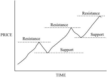
Clearly this chart shows an uptrend, with progressively higher peaks and higher troughs. Note that support and resistance as we are viewing them at the moment are horizontal lines at certain price levels—later we will look in more detail at lines that are angled and follow the trend.
We can illustrate exactly the same showing support and resistance in a downtrend, and that is represented in the following chart. It is clearly a downtrend, with progressively lower low points, and progressively lower high points, but with retracements or steps as the price goes down
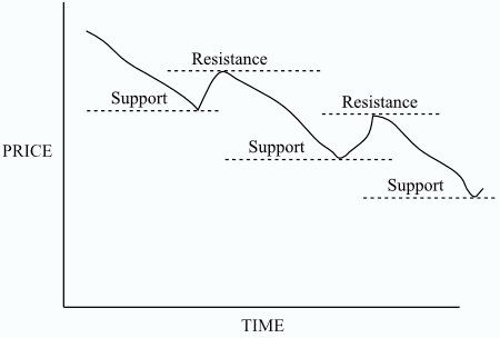
These are well behaved trending stocks. If the line did not progress like this, then that could be a sign that the trend is changing. For instance, if in the chart above the second time the price met resistance it only dropped down to the previous support level before going back up, and didn’t go to a lower level, then you would have to consider that the downtrend was failing. In fact, the price is in a critical phase each time it reaches a previous support level, and if it fails to keep going through it can be taken as a warning of a change to come.
Here is an example of what we are talking about. This is a sign that you would not ignore. In fact, as you’ll see in the next module on patterns, this is one of the classic bottom reversal patterns, and might well herald a change to an uptrend.
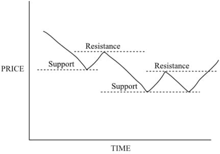
This is called a double bottom reversal, and is one of the better known patterns that you will learn to look for on charts, so that you can anticipate a trend reversal. As with many of these patterns, there is a mirror image called a double top, which is when an uptrend reverses to become a downtrend, and here’s what that looks like.
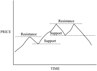
Again, these and other patterns will be discussed in the next module. These patterns aren’t guaranteed to start reversals, as not much can be guaranteed in analyzing the markets, but historically the odds point towards it. The important point is that in an uptrend you expect the successive resistance and support levels to be higher for the uptrend to be sound. In a downtrend, the opposite applies and the support and resistance levels should be getting lower, otherwise it’s a red flag. Any time you see a deviation from this definition of the trend, you need to evaluate your trading position. Here’s a real stock chart showing a double top and reversal.
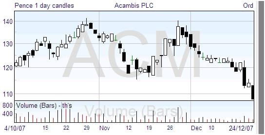
The second peak only rises as far as the first, hitting the previous resistance but failing to break through it. In trading terms, this means that the enthusiasm for a higher price is no longer adequate, and in consequence this pattern quite often presages a trend change.