
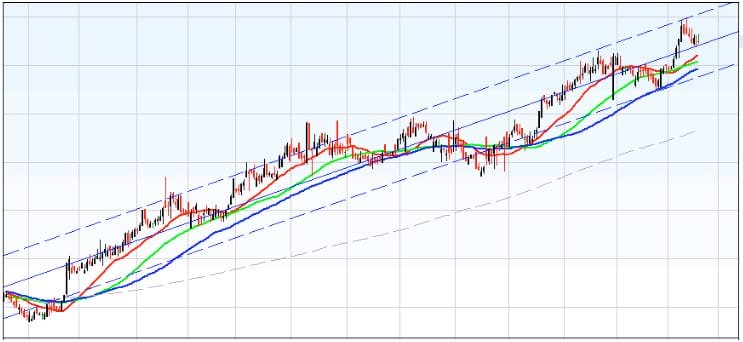
If the chart is trending up you should see something like the picture on the following page -:
I have deliberately used this chart over several years to point out an obvious up trend starting at the beginning of 2002 and changing mid year to a downward trend, moving into consolidation* in 2003.
For upward trending charts we obviously go LONG, and this is how we read the charts with our system of moving averages in place. The four lines give us a Open, Close and Stop Loss points, also Price Swings** and suggestions of long term trend formation.
Red Line: Upper Line
The RED line is our OPENING signal for both Long/Short. When the trend is up and is ABOVE the RED line. We OPEN a LONG trade.
Green Line: Middle Line
The GREEN line is our Moving Stop Loss for both Long/Short. We move our stop loss relative to that shown in the chart.
Blue Line: Bottom Line.
When the Red & Green lines cross the Blue line (up/Down) this signals a major trendswing/reversal.
When this happens we should NOT be trading anyway as the above signals would have kept us out. This is when we look to change from either Long to Short or Vice Versa.
Grey Line: Dashed Line
Our final Moving average. This is a confirmation indicator of a major trend. When the above lines move over the Grey line Up/Down confirm that trend Up/Down. When ABOVE the grey line the trend is very strong UP and when BELOW it is a strong DOWN trend.
*Consolidation is when the price is in a state of flux. There is no clear identifiable trend happening.
**Price Swing/Reversal is when there is a change in trend from one to another.
Now if we look at the same chart again:

We can now see where the lines tell us the signals to Open and Close and where to place our Stop Loss. In mid-July 2002 can see that there is a major reversal in the trend pointed out by the crossover of the Red and Green lines over the Blue line. We wouldn’t be trading when this happened, as our Stop Loss would have locked in the profit previously. What the signals are now telling us is that we should be going SHORT. The Downward trend is confirmed again as all the lines (Red, Green, Blue) have sailed past the Grey line.
In the few charts that I have shown so far, you will notice blue dashed lines and a single blue line – these are trend lines that are automatically drawn in on some charts. They can be useful in showing trading ranges. For example the above charts blue dashed lines show a break out of the trend near the start of the chart, consequently with a large fall. Where as those that are trending within the dashed lines, although continuing to fall, do so with less aggression.