
Advances and Declines
If you look in the Wall Street Journal, you’ll find a wealth of data about the markets on the previous day. Here’s a selection of the values that you can find —
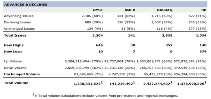
We’ll concentrate on the New York Stock Exchange (NYSE) data for this example. On this particular day, the DJIA had gained about 70, which was 0.63%, which meant the market was up. You can see there were significantly more advancing issues than declining issues, meaning that the broader market if anything did even better than the thirty companies which make up the Dow. The number of new highs hit during the day is 646, compared to only 10 new lows, which is very bullish. This opinion is backed up by the amount of up volume compared to the down volume.
You can see there is significantly more information available about the internal workings of the market than just the simple Dow Jones Industrial Average which many people consider tells them the overall market state. By looking at these numbers you can get a much better idea of the health of the overall market.
Now advancing issues is the number of stocks that advanced, declining issues is the number of stocks that fell back, and there are also a number that were unchanged. The advancing and declining issues numbers can be used to construct an advance-decline line (AD). The usual way to do this is to take the difference between the number of advancing issues and the number of declining issues. If, as in this example, there are more advances than declines, then the daily AD number is positive, otherwise it is negative. The daily number is added to the cumulative AD total to plot the day’s line. Here’s a chart of the Dow Jones Industrial Average and the US markets advance-decline line.
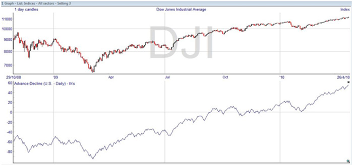
You can see that the AD line tends to follow the market average. It should do, and if it doesn’t that is a danger sign. The advance-decline line tells us whether all the other stocks in the US market are advancing in line with the 30 stocks that make up the DJIA, or the 500 stocks in the S&P 500 if you were to plot that instead. The saying in Wall Street is that the advance-decline line will tell you whether the troops are keeping up with the generals. Note that the actual values aren’t important, because the line starts accumulating values at an arbitrary point.
The market is healthy if the AD line is keeping up with the DJIA. When it diverges, there is bad market breadth. In fact, the advance-decline line tends to peak ahead of the market averages, making it worth watching. This chart is based on one day candles, which is best for short to medium-term comparisons. A weekly advance-decline line works better for trend comparisons over several years.
The advance-decline line has been criticized because the number of stocks traded on the exchange has increased. This has the effect of placing greater weight on more recent market movements. As a result, some technical analysts prefer to use the advance/decline ratio, which divides the number of advancing issues by the number of declining issues. Here’s an example of that chart.
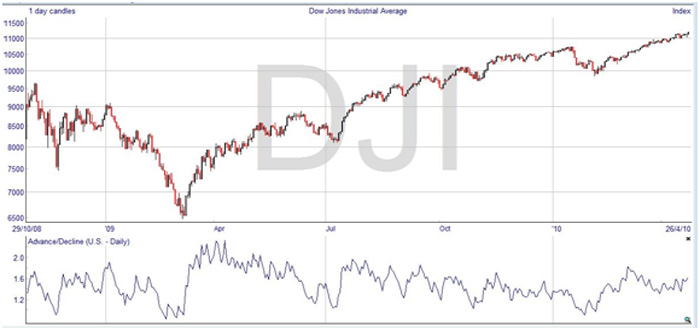
The advance/decline ratio in its calculated form is very spiky, so for this chart smoothing was applied to bring it more in line with the DJIA. You can see that divergences from the average are much more noticeable, as is the degree of anticipation in the line compared to the average.