Different Time Frames
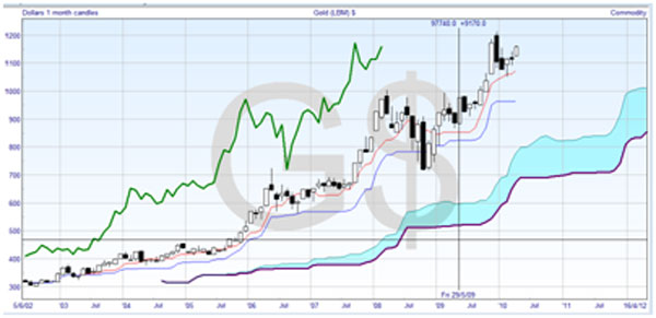
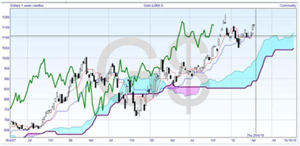
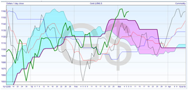
I’ve pointed out during the course that technical analysis can be applied to different time frames with good effect. Cloud charts are a particularly good example of this. You can keep the same numbers and just change the scale, and you will get a different picture of the price action with each chart. Here are three charts of gold prices.


The top chart is based on monthly candlesticks chart, the middle one is based on weekly candlesticks, and the bottom one uses daily closing prices — candlesticks are not available on a daily level for gold. See how you can instantly follow the trends at each scale.
The monthly chart is considered very long-term, and is plainly consistently bullish. The turning line and standard line showed no signs of crossing, and are well above the cloud. Although the price and cloud are proceeding in a stepwise manner, over the long term there is little hesitation.
The weekly chart is still a long-term chart, and is currently bullish, but had some issues in 2008/2009. The lagging line never went below the cloud, but the price penetrated significantly. In the last year, the turning line has been providing support to the price.
The daily chart is medium-term by trading standards, and much more busy than the longer-term charts. You can see very bearish action in the first half of 2010, which is borne out by the cloud color. The cloud failed to provide any support to the price or lagging line, and the bullish cross of the turning line up through the standard line in February heralded a rally to $1140. Note how the price, the black line, tested the base of the cloud in March, and when the support held the price started to rally, bouncing back to test support on span B.
This brings us to a discussion of the trading time horizons of different types of trader. The extreme daytrader has a time horizon of minutes, and will trade off a chart with minute by minute candlesticks that extends perhaps half an hour backwards. Another type of daytrader may have a time horizon of hours, and use a five or 10 minute chart interval, which would show up to four hours of the previous price action.
A short-term trader, by my definition, may be looking at staying in a position for a few days up to a couple of weeks. They should trade off an hourly chart which shows three or four days of history. If you are looking to hold a position for weeks, then you might use a daily chart which shows you the past month of activity. Anything more than this I would categorize as an investor, and they would start with weekly charts intending to hold the securities for months.
Having said that, you should always go up and down the timeframe from your trading chart when you use cloud charts. The longer-term timeframe would give you the overall picture, and you would not need to refer to it very much. It might give you a better sense of long-standing support and resistance levels. The shorter-term timeframe is useful when planning your entry.
Whatever type of trader you are, it’s a good idea to print or screen capture the charts when you enter a trade, and make notes of your analysis and feelings for each of the time frames, so that you have an easy reference to check what went right and what didn’t work.


Join the discussion