
Now you are familiar with how charts are drawn, here are examples of line, bar, and candlestick charts which are all drawn for the same stock and timeframe. You can use these to show you the information in different ways, depending what you are trying to see.
Bar Charts versus Candlesticks and Point and Figure Charts
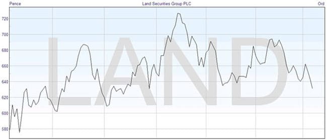
For instance, if you simply want to look at the trend of a price then you may find that the line chart of the closing prices is the clearest representation: –
If you are prepared to closely examine the chart, then the simple Western bar chart can give you all the information that you may need. Note how the height of the bar shows you just how active the pricing has been, and how the relationship of the tics on each side will reveal much more about the market sentiment: –
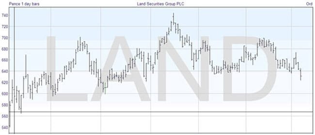
But it can also be difficult to focus on the tics, particularly on a scale when you want to see the progress of the price over a reasonable length of time. Nonetheless, that was all the Western trader had until comparatively recently.
The use of a candlestick chart makes the exercise of interpreting the price movements much easier. In fact, the candlestick chart is so universal now in trading it is hard to believe that it has only been used for a few decades. Simply comparing the chart below with the one above, you can see how much more visually appealing it is, and when you are used to interpreting the meanings, you may wonder how traders ever managed using simple bar charts.
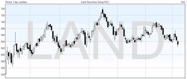
Notice how much more graphic the candlestick chart is than the bar chart. The white candles, showing up days, are naturally more predominant when the price is rising, and the black candles when it is falling, and the mix and size of the candles is significant, as you will learn. The white and black colour scheme is possibly used the most, but most software will allow you to set the colours to whatever you want. While green and red is an alternative colour scheme, you may also commonly see yellow and blue. As long as they are distinct from each other, you will be able to take advantage of the graphic representation to help in your analysis.