
Line Charts
The first charts you were introduced to, in Module 1, are called line charts because they represent the progress of a price over time by a single line which goes up and down. This line is based on the closing price of the stock each day. Line charts make up the most simple chart type in trading because they are uncluttered.
When stocks, or anything else for that matter, are traded during a day, the price can vary – it depends what the buyers and sellers are looking for at any particular time. The stock price on the first deal of the day, when the market opens, is called the opening price. Not surprisingly, when the market closes at the end of the day the price used for the last deal is called the closing price. In between, the price changes, and it may set a higher price and/or a lower price than either the open or the close.
Explaining Line Charts
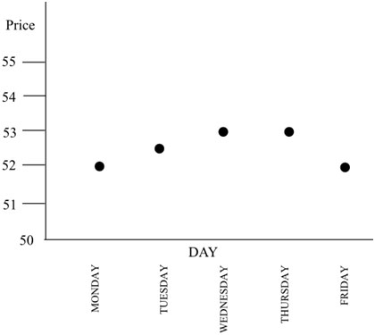
To illustrate this simply, here’s how you would manually draw a line chart. First you plot the closing prices for each day – for the example below, Monday closed at 52, Tuesday closed at 52.5, Wednesday and Thursday both closed at 53, and Friday’s close was back down to 52.
Line charts plot the closing prices for each trading period and then connect them with a single line.
This of course is a very simple example of a daily chart which only covers one week. Commonly you would work with a daily chart, but that may go back six months, and you’ll see plenty of examples of those later. You can use charts that plot hourly prices, or weekly prices, and you will choose these according to what you want to know, and how you are trading.
Then all you have to do is connect the dots to get a simple line chart –

The same information, but adding the line allows you to see more easily the direction of the price. In this case the price rose over the week, but went back down to where it started from by the end of the week.
Some traders really like line charts, as they are simple and it is easy to see how the price is moving. For instance with line charts, it is relatively easy to spot support and resistance levels. In some trading systems, they may contain all the information that you need. But they only include the closing prices, so you are only seeing one quarter of the pricing information available, as you’re leaving out the opening price, and high and low prices. If you are getting your information from a newspaper then closing prices may be all that you have available.
Most traders would agree that the closing price which is used in line charts is the most important, as it represents the end of the day when everyone has had their say, and settled on a final value. If it’s all the information that you have, then you will have to base your trading on its values. On the other hand, there may be (and is) a lot more to be learned about share prices by looking at all the information, and it should be available online. If you want to see all four daily prices, you don’t have to look at four different charts, as there are a couple of ways that the information can be shown on the same size chart without losing clarity.