I mentioned in the last module the oscillator that is made up of two exponential moving averages, and it goes under the splendid name of Moving Average Convergence/Divergence Indicator. This is usually shortened to MACD, and it is pronounced Mac-dee. This was invented by Gerald Appel, and it combines the attributes of an oscillator with a crossover system, giving you trading signals.
I’ve shown the full version here, which includes a histogram which plots the difference between the two lines as a series of vertical bars (in green). I’ll explain use of the lines first.
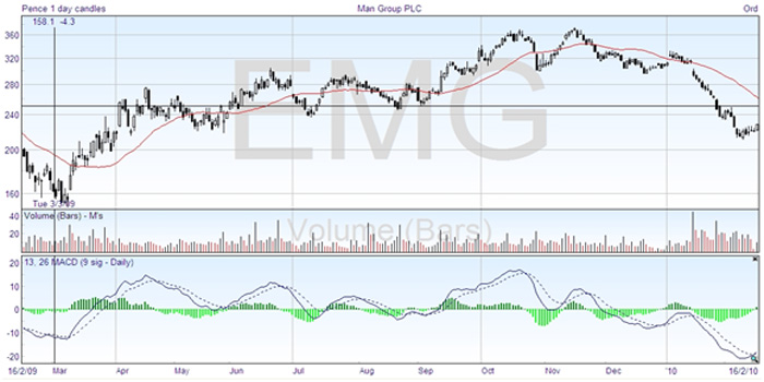
The MACD line, shown solid above, is the difference between two exponential moving averages, the 13 day and 26 day in the example shown. The crossing of two moving averages can be taken as a signal to buy or sell, as we saw in the previous module, but it tends to lag behind the price action. The MACD line is a plot of the convergence and divergence of the averages. If you wait until the convergence is zero, that’s the same thing as the two moving averages crossing.
The clever idea which Appel devised was to show how much the convergence and divergence was varying by plotting a moving average of the MACD line. This is a dotted line on the chart, in this case a 9 day exponential moving average which is a signal line. This then anticipates the crossing of the zero line, and gives an earlier signal without the lagging of the simple double crossover method.
The MACD line is the fast line, the signal line which is smoothed by being an average is the slower line. When the fast line crosses to above the slow line, that is a buy signal, and when it drops down through the signal line, that counts as a sell or short signal.
But as the MACD line fluctuates above and below the zero line, it also acts as an oscillator indicating overbought and oversold conditions. Although there are no boundary levels assigned, when the MACD line is high above the zero line, the security is overbought; and at the lowest points it counts as oversold. This means that the best buy signals are when the lines are well below the middle, and the best sell signals require the lines to be high on the chart.
For the chart shown above, you can see that the middle area of July, August, and September is not indicated as an extreme value by the MACD, and wouldn’t be considered a good trading opportunity using this indicator. If you look at the price action above, it shows changing short trends, going sideways. They could be traded, but are not as good as the major trends.
The trades which the MACD indicates clearly are going short in the middle of April and end of June, and also in October and November, and taking a long position in March and in February this year. The short trade in April doesn’t last long, but you can see that the MACD would have given very good results overall.
And just to make the point again, you should always watch oscillators for divergence from the price trend. It can give you early warning of a change. In the chart above there are no clear examples of this, as the MACD seems to be following the price line fairly closely.
Back now to the histogram, that is the vertical green bars either side of zero. These bars show the difference between the two MACD lines. They are positive when the fast line is above the slow line, and negative when the other way round. Therefore when the histogram crosses zero, it coincides with the two MACD lines crossing.
If this was all the histogram meant to you, then it would not have any value. But the histogram gives you an easy visual way to tell when trends are changing. If the histogram starts reducing, or coming back to the zero line, then that means that the trend in place is weakening, and losing momentum. Turning back toward zero must always come before a crossover signal, and it gives you an early warning so that you can prepare to liquidate existing positions.
There are many other types of oscillators available, and you can explore them on your charting package or one of the free online services, such as stockcharts.com, or bigcharts.com. The same principles apply universally to all oscillators —
- The oscillator is most useful when its value is at an extreme, either high (overbought) or low (oversold). It is an indication that the price is overextended. Note however that you can have extremes in the early stages of a trend, and this does not necessarily signal an imminent reversal.
- If the price and the oscillator diverge when the oscillator is in extreme position, then usually this is a good warning of changes to come.
- The oscillator crossing the zero or middle line can also give signals. A good practice is to buy long only when the oscillator is below the middle, and sell short only when the oscillator is above the middle.
- Don’t let the oscillator control your trading without taking other factors into account. You should always do a trend analysis, and not let the oscillator persuade you to trade against the trend. The oscillator is a secondary indicator.
Using MACD to Clip the Trend
Do you use the MACD or even moving average crossovers as a way to determine the overall trend in your analysis? One thing you may have come across in the past is that although these are great methods, they always produce drawdown periods for you when the market is correcting or consolidating, and sometimes these periods can last for months.
One way to eliminate or reduce the effects of these consolidation periods is to ‘clip the trend’, and here we’ll demonstrate how to do this using the MACD indicator.
If you are in an uptrend, when the leading MACD line crosses below the trigger line, the uptrend is now clipped, leaving you with a decision to either not trade this market, or to look for shorts. Once the leading line crosses back above the trigger line, you can once again trade this market or now look for longs.
Likewise; if you are in a downtrend, when the leading MACD line crosses above the trigger line, the downtrend is now clipped, leaving you with the decision to either stay out of this market or look for longs. Once the leading line crosses back below the trigger line, you can once again trade this market or now look for shorts.
On the chart below, we have an up trending market which is being shown by both the MACD being above zero (one method for determining a trend), and a moving average crossover, where the short mav is above the long mav (the red line above the green line on the upper part of the chart).
The black arrows are showing you where the trend is being ‘clipped’ by the action of the MACD crossover (leading red line crosses below green trigger line), and as you can see on all occasions, a consolidation period forms, which is not ideal for a trader wanting to trade the trend.
The red circles are demonstrating when the leading MACD line crosses back above the trigger line and where the trend once again resumes.
