
New Highs and New Lows
Another pointer to the condition of the stock market can be found in the new highs and new lows which are published on a daily and weekly basis. You can see these are published along with the other information, and they can be found on financial websites as well as in the press. They give another insight to the strength of the market. The number of stocks advancing compared with the number declining shows one kind of strength, but whether those stocks are achieving new 52-week highs or 52-week lows as given in this information is also very pertinent information. The following chart shows the new highs-lows for the previous 250 days, which counts as the trading year, and this is the time span normally used but it can be modified if you wish.
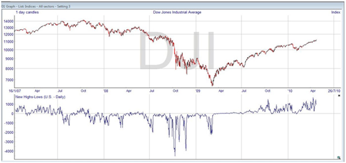
You can see there was an extremely poor situation towards the end of 2008, recognizing the financial crisis. It wasn’t until the second half of 2009 that new highs started to outnumber the lows, and given the weakness a year before, it is not surprising statistically that highs were seen.
If you have a strong market, the number of new highs should be much greater than the new lows. If the number declines, then there is a warning that the strength of the market is waning. However, the figure can reach an extreme which would indicate overbought or oversold conditions.
ShareScope gives a couple of other ways to view the new highs and new lows information. You can look at the cumulative new highs minus new lows information, as shown below, and the absolute value of this depends where the calculation started. You need to observe changes of direction and divergences to be able to draw conclusions.
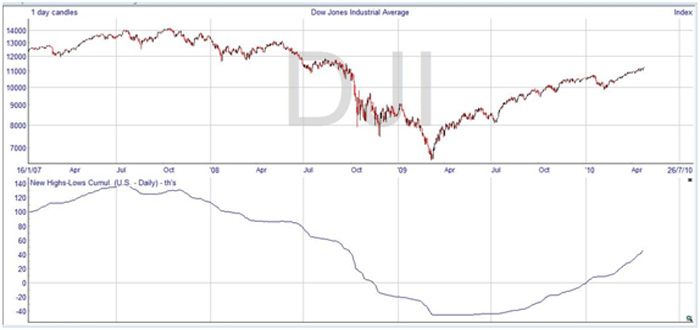
You can see that in the drastic moves of the stock market in 2008 and 2009, the cumulative new highs new lows indicator acted simply as expected. Given the tremendous fall in prices at the end of 2008 and beginning of 2009, after this period very few new lows were found. But as the market was recovering slowly, and not reaching previous levels, there were also very few new highs. The cumulative indicator is horizontal for a stretch, as with no new highs and no new lows there was nothing to make it move. Given a more balanced market, you would be able to tell more from the indicator.
A third way of looking at the new highs and new lows is by dividing one by the other. If the new highs and new lows are equal, this gives a value of one. Any time the new highs outnumber the lows the number will be greater than one, but if lows outnumber the highs the value becomes fractional. Here’s the chart for this form of high low indicator.
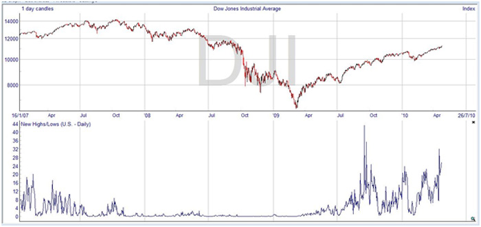
Again, with the distorted markets of 2008 and 2009, this indicator is not as revealing as it might be in a more normal situation. You can see that it is a very low value, and while not totally clear it is almost certainly between zero and one, indicating a depressed market. But you can also see that it hit much higher values during the recovery. The excitement and extreme values in September 2009 no doubt arose because of the enormously depressed previous year, but it is interesting to note how the indicator seems to precede the price moves. Look for instance at July, where the reversal of the downtrend is clearly signaled a few days before the price changes. The same thing happens in the beginning of 2010, where the double bottom on the high/low chart happens before the price chart. This was pointed out by Dr. Alexander Elder in his book Trading for a Living, and he described the index as ‘probably the best leading indicator of the stock market’.