
In the Western world, point-and-figure charting predates bar charts and candlestick charting. It was first talked about in the 1880s and 1890s, when it was known by the name Charles Dow used, the ‘Book Method’. The name point-and-figure seems to have been applied in the 1930s. In comparison, the first reference to bar charts was in 1896, and candlestick charts, although some centuries old in Japan, only came to the West in the 1980s.
There are two important differences between point-and-figure charting and the charting we have looked at so far. All the charts we have used have an equally spaced timescale along the bottom. Point-and-figure does not. And all the charts we have used have had the facility to see the trading volume on each day, whether or not we turned that section on. Point-and-figure traditionally has no direct way of determining the volume traded.
Point and figure charts are useful for tracking price moves in instruments without being distracted by intraday day-to-day noise or periods of stagnation. The point-and-figure chart concentrates on plotting the price action, which means that if there is not significant price movement – which we’ll define in a moment when we talk about how to draw it – the point-and-figure chart often will not show anything. Unlike the candlestick chart, there is no need to draw a symbol for each day of trading. That’s not to say that there is no indication of timescale on the chart, as you do need to know when the events occurred. When there is price action which is sufficient to be plotted on the chart, the appropriate date is added along the bottom. This means that the bottom scale is not uniform, but changes as required by the charting.
It’s not true to say that there is no indication of volume with point-and-figure. As price change activity is recorded on the chart, if there is a lot of activity, generally corresponding to more volume of trading, you will see more charting. Nowadays with the power of computers you may also find a more direct measure of volume available on your point-and-figure chart. It won’t show you the daily volumes, but the sum of the trading figures for the particular column being looked at.
That’s enough initial introduction to the point-and-figure chart, now it’s time to look at the chart for the same security that we have been seeing on the conventional charts –
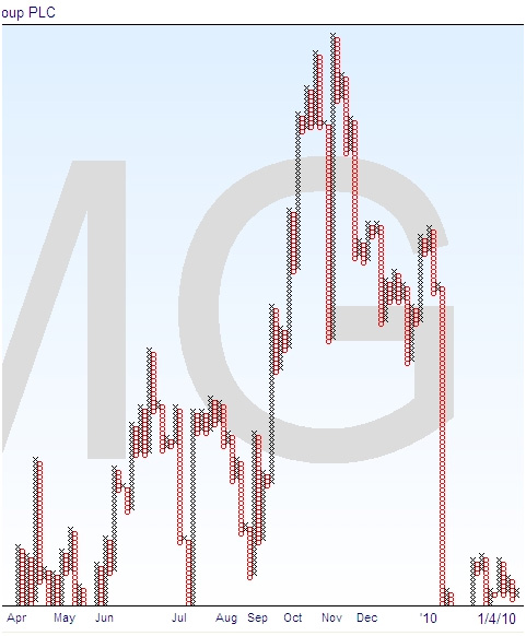
This is the most detailed point-and-figure chart available for this security, which explains why it is so tall. You can get less detailed charts for other purposes, rather like you can look at daily candlestick charts, or switch to weekly for a more general picture.
Here’s the candlestick chart again for comparison –

Looking between the two, you can see the obvious similarities in terms of the general shape and the peaks and troughs.