
The three line break is a way of looking at charting that some say is more reliable for showing trends, although there is criticism that it usually gives a late signal. It is another system where plotting a further column is dependent on events, so again, like the point-and-figure, the date line is not evenly spaced. It is a method that utilizes the concept that a trend has momentum and continues until a definite need for a reversal.
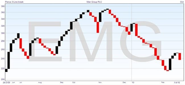
This again is a chart of Man Group PLC, with which you should be getting familiar by now. It doesn’t cover the whole year, as the candlestick chart does, because of the method of only plotting when you have something to say.
As you can see, the uptrends are plotted in black and the downtrends in red, and this is selectable in the software. Only the closing prices are used, and for the sake of explanation I will assume we are starting with an uptrend. This is the way it is plotted. The first line will be black and plotted from the closing price yesterday up to the closing price today. For each following day you look at the closing price, but if it is no higher than the one you have already plotted, you don’t draw anything. When the day comes that the closing price is higher, you move over to the next column, plotting from the top of the previous column to the new price. In this way, an uptrend makes a sort of staircase progress upwards.
Now this is fine as long as the price keeps going up – either the price goes higher or not, so you plot another column or leave it alone. If the price goes down, then you have a condition for reversing the trend shown on the chart. The condition is that the closing price must fall below the low of the third previous line to make a reversal, which is where the name Three Line Break comes from. When it does, you move over to the next column and plot from the bottom of the previous column down to the new price.
Once you are in a downtrend, then you will plot further columns when, and only when, new lows are formed. If the price happens to start going up, then you will look for a ‘Three Line Break’ above the third previous line before starting to plot a new uptrend.
Take another look at the chart. See how the start of each trend is a long column. This is because it waits until the level of the third line is broken before it changes trend. You can trace this across on each change in trend.
Note two things. The need for the price to go further than the third previous line for a reversal means that it has to be a certain size before it can be drawn, which filters out minor variations in price. And note that the system requires a definite trend to work at all, and is no use in a sideways market.
You can trade with the system by taking a position after the first column of a new trend, which signals the reverse. This is a clear signal, and easily actionable. The problem is that the trend has already moved significantly in order for the reversal to be plottable — as I said in the beginning, this tends to give a late signal. The other problem is that the obvious place for a stoploss would be the bottom (for an uptrend) of the reversal column, and as the column will be long, this represents a significant loss if a trade goes against you.
So the three line break will work to give you a clear signal and profitable positions if there is a strong trend, but does have some weaknesses.