Although daily charts are the most widely used by traders, charts plotted on a longer timescale give a perspective on the markets and the particular shares you are interested in. When you are analyzing trends for your trading system, you really need to look at the longer time scale to be sure how the daily fluctuations are fitting in to the overall picture. Here are charts of the same security shown previously plotted on weekly and monthly bases. The weekly one covers three years, and the monthly one goes back 10 years.

This weekly chart may change what you thought about the security from just looking at the recent daily chart. The monthly one below changes the picture yet again.
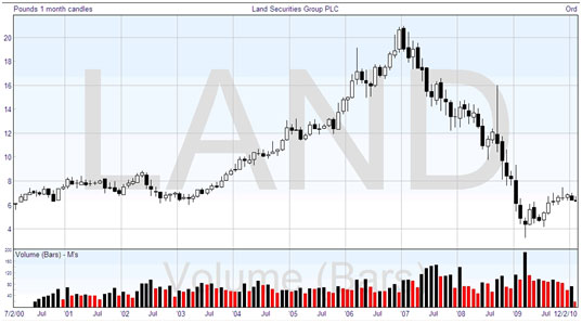
You can see how your ideas about the shares change when you consider the history of it in more depth. The daily chart covering the previous six months was gently meandering. Looking at the weekly chart (top), you can see that the shares plummeted in value for a substantial period of time just before those six months, and this might have the effect of making you think in a different way when you come to trading.
And again, the lower chart shows the monthly picture over the last 10 years, and this presents another different outlook. Prior to the plunging prices, these shares were exhibiting steady growth for many years. It’s all part of looking at the big picture to help in analyzing the trends and outlook, so that your forecast may be more cognizant of the underlying factors. If you can arrange to couple up at least one more screen to your computer, it becomes much easier to make these comparisons.
The time period that you study on the charts should match up with the period of time you intend to hold a trade. So if you’re planning to hold positions for a few days or more, daily and four-hour charts will be most useful to you. If you are a planning to trade on an intraday basis, it is sensible to focus on charts of between 10 minutes and 1 hour.
Below you see the same monthly chart, but plotted with a logarithmic price scale, as explained earlier. Compare this to the chart immediately above. With it you can see that the decline in price from 12 to 6, a halving in value, was much more precipitous than the halving from 20 to 10. The decline has two distinct angles. In the chart above with the arithmetic price scale, the decline appears to be fairly steady and consistent. As mentioned earlier, it is worth experimenting with both types of scale, as one may reveal factors that the other masks.

Note also that although we are talking about using longer-range charts to check the background of a share we might be considering trading, these charts stand in their own right and can be examined with technical analysis to determine the expected long-range price movements. Not many people consider technical analysis for the long term, and most investors believe that fundamental analysis is the only route for profitable investment. This is not the case. To repeat, technical analysis can be applied to any timescale of charts.