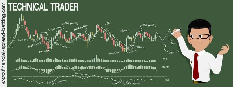
How to use Technical Analysis to Make Money
Today’s course will look at the importance of technical analysis. In fact, if spread betting has been the trading instrument phenomenon of the past few years, technical analysis, and in particular charting, has been the leading way to research the phenomenon in recent times. In some ways this was bound to happen, given that we have apparently finished a series of decades when the only direction for shares was up. Read on, and find out what makes charting so popular.
There are two good reasons why you should consider technical analysis.
- ‘Buy and hold’ is dead
In the past you could go long of any shares and eventually, if you waited long enough, you would likely profit. That’s no longer the case. - Brokers were simply following the trend
Brokers’ buy notes and tips in the late 1990s were correct, not because of their analysis, but because of the up trend of the market. Now the trend has changed and the shortcomings of fundamental research is being revealed. Chartists are now credited with predicting the bear market – and how long it will last.
The problem that has been highlighted in a bear market is that much of the financial world is geared to markets going up and has a vested interest in them doing so. There are only two main groups that are not bothered whether this is happening or not: chartists and spread betters. Chartists are only really concerned with being seen to predict the markets correcting and spread betters are happy as long as it moves enough for them to trade quickly and successfully.
What is Technical Analysis?
Technical analysis is the study of price action and behaviour that bases trading decisions purely on historical data. It works in all timeframes, from years to intra-day, giving rise to the growing band of day traders who trade minute-to-minute fluctuations. The widespread availability of software that specialises in allowing traders to chart and analyse price information as well as trawl markets for the best buy and sell opportunities in equities, indices and commodities is tailor-made for those who spread bet.
To appreciate the effectiveness of technical analysis it is useful to understand the logic behind this method. There are a number of key principles upon which technical analysis is based:
- Everything is discounted and accounted in market prices. All the knowledge, irrelevant if this is of economical, fundamental, political, psychological or other nature is already reflected in market prices. Technical analysts are of the opinion that the real value of a stock at any one point in time is exclusively influenced by the forces of supply and demand, as seen in trades made in the stock exchange where it is quoted. Technical analysts do not try to understand the underlying forces of a shift in supply and demand; instead they are only interested in the price movements. If demand exceeds supply, prices will go up. On the other hand, if supply exceeds demand, prices will go down.
- Prices move in trends and these trends tend to persist. Once a trend is established, this remains intact until it ends. For instance, if a share’s price is moving up, it will keep moving up until there is a clear change in direction. It is usually better to follow a trend than to attempt to trade against it. A trend will usually provide a warning that it is about to reverse. The warning can sometimes last for a day or longer, so it is crucial to become familiar with recognising these signs. Common price reversal patterns include Double Tops, Shooting Stars, Doji’s and Head and Shoulders.
- Market action tends to be repetitive in that certain patterns appear repeatedly over time on charts. Human nature is such that people tend to react to similar situations in consistent ways. As a general rule, people will behave in a similar way in the future as they have done in the past. Since the markets are a reflection of the behaviours of people (stock market traders, investors, institutions..etc), technical analysts study the markets to see how people will react under certain conditions and thereby, how stock prices will ultimately move. Technical analysts analyse the recurrence of similar characteristics in an attempt to identify the likely future price direction.
Unlike fundamental analysis, where hours may have to be spent reading and comparing differing opinions on a certain market, technical analysis can narrow choices into a few specific ideas within minutes, as well as provide stop loss and profit target points. And what’s more technical analysis will assist you to trade any financial asset available throughout the world in whichever exchange it is listed; irrespective whether its a forex pair, share, bonds or commodities…
For an explanation of why technical analysis works on an index please refer to this article.
Tilt Probability in your Favour
So as you can see, technical analysis can be summed up as the study of individual stock prices and the overall market based on supply and demand. Charting is the visual part of technical analysis, where it is assumed that price trends and patterns can be relied upon to provide an insight into the future.
Trading software and financial websites have meant that almost everyone has access to charts of the share or markets that they are interested in. To the beginner, most charts resemble a random walk through time rather than anything that could provide any predictive clues. The trick, if there is one, is to identify trends and price formations to form a logical conclusion about what could happen next. The mistake that most beginners make is to not have decided before they put on a trade where their stop loss and target is. Charting is about tilting probability in your favour, but being prepared if prices turn against you.
Spread Betting Tip: Investor sentiment is most clearly seen through price action and volume. If big players are buying, volume is high on upward moves over specific time periods and price action will be positive (and vice-versa).
Charting helps you reduce Risk
Charts are a trading fingerprint. They include every buy and every sell traded in the market.
In the past couple of years Vodafone has fallen around 300p. In this time there have only been a handful of broker ‘sell’ recommendations, but tens of ‘buys’. If you had followed fundamental research, you would have held on to the shares and would now be sitting on a big loss. But, given that the share has been in a downtrend for years, you would have been hard-pushed to find a chart that would have said buy.
You are able to manage risk by knowing what your maximum loss should be and your profit target should be before you take a position. Charting is ideal for this in that it provides a valid market level based on support levels and resistance levels.
You can display the price action of a chart in several different ways. A popular option is the bar chart, because it displays the greatest amount of information. As well as the open/high/low/close of the day/week/month, you can pinpoint support and resistance levels.
Key Charts and how to Read Them
Let’s take a look at the major chart types. The first three show Vodafone’s past performance.

The Line Chart (refer to picture, up):
The simplest form of chart connecting end of day/time period closes. This is very limited in scope as it provides no information about the stock’s movement during the day.

|  |
The Bar Chart (refer to above picture, center):
The open high, low and close of the day are represented in bar charts. Each chart represents one trading session – depending on the chart plotted one session could be 5 minutes, one day, a week and anything in between. This chart is used to determine the strength of price movement over the time period in question. The top of the bar represents the highest high of the day, the bottom represents the lowest low of the day. The tick on the right side of the bar represents the close while the left bar sticking out represents the price at which the stock opened.
 |
 |
The Candlestick Chart (refer to picture, up center):
Candlesticks are a more graphical way a tracking price action. A Japanese version of the bar chart, where a lower close than open on a day/time period is shaded dark (sometimes red) and a higher close is left light. Candle stick charts show more information than a simple line graph. The box of the candle is called a real body and represents the movement between the open and close of the stock. The lines below or on top of a box is known as the upper and lower shadow and represents the movement of the stock between the open and close of the stock.
Colours are usually green or red.
Red signifies that closing price was below opening price.
Green shows that closing price closed above opening price.
By learning to read charts you learn to read investor psychology. Candlesticks are very helpful as they visualise price movement and can highlight obvious indications of market uncertainty and so forth. The minute you forget about the psychology you lose money. For example, when the markets are falling heavily, you can forget about lines of resistance. They mean nothing in such circumstances. Same with Fibonacci levels, that some think have some bull mystical powers. You have to get inside the heads of the trading population. If you can do that, you’ll make money. But it takes time. Chart reading is all about trying to read the emotions (or sentiment as some say) of the market. When day-trading under normal circumstances, 15 minute candles can be useful indicators in this regard (although even in such cases you have to ignore the short-term candles if the market sentiment is extremely negative).
You can see from just one candle what the open price of the stock was, the highest price to stock got to and the lowest point the stock got to and finally the close. The candles also show the difference between the open and close if this is positive then the candle is usually shown empty with the close shown on the head of the body of the candle, if negative the candle will be filled with the close price being the lowest on the body. By looking and analysing the differing shapes of candle it is possible to predict price movements on these alone.
Note: Candles work best for reading psychology. Candlestick patterns e.g. Island Reversals, Three White Soldiers etc…appear to work some of the time but I tend not to use. In any case keep in mind that some things tend to work better on some shares than others. The fastest place to see whether candles offer good entry/exit signals for a share/index is www.britishbulls.com, where they show two years of signals derived from daily analysis.
 |
 |
Intraday, Daily or Weekly/Monthly Charts?
This is just a case of experimenting what timeframe works best for you. If you base your trades on daily charts but find yourself repeatedly checking a 5-minute chart to see how your trade is faring, then perhaps you lean more for intraday trading. Likewise, if you trade off weekly charts but keep checking the progress of your trades on a daily basis (if not more frequently), then again maybe you have more connection with daily charts. One word of caution; if you use different timeframes to trade it is important not to confuse the timeframes, and in effect become a day trader trading off weekly charts.
How much data should I load on my chart?
In technical terms the amount of data that you analyse on your chart is referred to as the ‘look-back range’ or ‘market memory’. As a guideline you can refer to the table below -:
| Chart | Look-back range |
| 5 minute | 2 days |
| 15 minute | 3 to 5 days |
| 30 minute | 1 – 1.5 weeks |
| 1 hour | 2 – 2.5 weeks |
| 4 hour | 1 month |
| Daily | 1 year |
Head and Shoulders Chart (refer to picture, up center):
The most famous chart pattern of them all used to identify price reversals. The ‘head’ is a price peak between two lower peaks or ‘shoulders’. Basically what is happens is the stock makes an initial attempt to climb, which falters causing the first shoulder. Secondly, the head is formed by a greater change upwards and it is at this point that we being to look for a Head and Shoulders pattern. The neckline does not have to be horizontal – it may be flat rising or falling. Rising markets are generally characterised by up trends that demonstrate higher highs and higher lows. The term head and shoulders describes the pattern seen when a market fails to make a higher high. This is termed the right-hand shoulder of the formation. If, following this lower high a lower low also made, taking the price below the neckline, this is regarded by chartists as a sell signal.
After breaking the neckline (at point F), prices sometimes pull back to it on low volume. This weak rally can be a good shorting opportunity with a logical stop just above the neckline.
Head and shoulder’s tops often have typical volume patterns with volume being often lower on the head than on the left shoulder. It is even lower on the right shoulder. Volume tends to increase when prices break the neckline. When prices pull back to it, volume is very thin. A head and shoulders pattern provides an approximate target for the new trend.
And below is an example of an inverted head and shoulders pattern. The share price of DTY has fallen 30% since 2008 (at time of writing: December 2009) in spite of increased earnings growth and forecast earnings growth. Note: This is purely illustrated as an example; do your own research!

The Head and Shoulders bottom (aka Inverse Head and Shoulders). The pattern shares a number of traits with its comparable partner, but relies more heavily on volume patterns for confirmation. It is a major reversal pattern and forms after a downtrend, with its completion marking a change in trend.
The Importance of Trend Lines
At any one time the market may trending, turning or ranging/consolidating so your first job is to find out in which state the market is now and what strategy those conditions dictate.
The trend line is based on connecting at least two support or resistance points. The question is where? In fact, these can just about be any two points on a chart. It is best to regard them as your guess as to where the market is headed over any particular timeframe. It may sound strange, but it does not really matter, because if you get it wrong, the trend line will be broken and your particular theory of where the market is going will be proved wrong. Hence, the concept of the ‘natural’ stop loss, one that many a fundamentalist would love to have.
Surprisingly few shares are in an obvious trend and even when they are, you need to be able to identify the best buy/sell points so the position doesn’t go against you as soon as you enter it. Draw trend lines and price channels that best fit the chart. Then use end-of-day closes below/above these lines as entry and exit points, even if they eventually prove to be only temporary.
How to determine a Trend
In determining a trend you use price-action analysis.
 |
|
|
 |
Trends whether up and down figure in financial markets for long periods. At any one time, there can be several trends at work in a particular market. So, a share might be in a long-term up-trend, but in a short- and medium-term downtrend. In a downtrend, each high and low is generally lower than the ones before them, while each high and low in an uptrend is generally higher than the previous ones. By drawing a line through the lows of an uptrend, or the highs of a downtrend – we can create an easy reference-point for a trading strategy; this is a very simple form of technical analysis which is usually quite obvious from a chart. A numbers of traders also like to add a moving average to a chart which is simply the average closing price of the asset under consideration as measured over a specified period of time.
Higher Highs and Higher Lows = Bullish
Lower Highs and Lower Lows = Bearish
Trending: Higher Highs and Higher Lows
Example by CHART TRADER: Let’s have a look at ALN, a fair example of a share in an uptrend where the market has tried its best to get u out of the position.

All looks fairly random…
Let’s now chart the share using Higher Highs and Higher Lows. Some tradeable patterns are apparent straightaway. Of course the market knows where support is better than most and will try intraday to get you out of your position, all part of trading. Now I know a lot of traders having bought all the books and spent hundreds of hours watching intricate set ups, don’t believe that charting can be this simple, but if you want to trade a trending share you need to trade Higher Highs’s and Higher Lows’s and then make it as complicated as you wish.

The pale blue lines are an example of the boxes u would have been trading as the trend developed, support and resistance > think of it as an office block, on floor 1 you have the floor (support) ceiling (resistance), when you move up to floor 2 the ceiling is now the floor (support) and a new ceiling.

Support and Resistance Levels (refer to picture, up center):
Support and resistance levels represent points where a market has temporarily formed a top or a bottom. Support and resistance occur because people have memories of past prices and our memories prompt us to buy and sell at certain levels. Spread betters and traders can use these levels as profit targets, depending on whether they are bullish or bearish.
Support and resistance are like a floor and a ceiling, with prices hovering between them. A ball bouncing up and down onto a ceiling and floor is a good way of understanding support and resistance. When the ball bounces to the ceiling (resistance), it comes back to the floor (support). The ball then gets to the point where it has cracked holes on the ceiling or the floor, and breaks through one of them. If the ball breaks through the ceiling (resistance), it’s called a breakout. If the ball breaks through the floor (support), it’s called a breakdown.
Support is a level where traders generally agree on the current value of the stock. It is the point where most agree on the lowest value, at that time on the stock. Over a given period the stock may return to this value and when it does we can expect it to return somewhere near or at this support value.
Support and Resistance points allow us to see where traders believe a stock has good value and where it is seen as over-priced. By drawing in support and resistance levels, we can see where in relation the current quote price is and combined with our own indicators and systems, see if there is going to either be a continuation in the support and resistance points or if indeed we are breaking out to new highs or new lows.
Trading Range:
Most shares occupy ‘ranges’, in the sense that statistically they spend over 80% of their time in such a state. Even if a share has bounced off support and resistance levels many times, you can make life simple for yourself by buying and selling these levels.

Breakouts (refer to picture, up center):
This occurs when a share ruptures a previously established trading pattern. The activation is the point at which the price moves above the high or below the low set during the period. Breakouts can be quite profitable as they can last for a number of days and in some cases even weeks.
The most straightforward way to identify trend reversals is to use support and resistance. Where past support and resistance levels have contained the price action repeatedly in the past, there is a good possibility that they will continue acting as a ceiling to the share price in future. Alternatively, you can check for breakouts below a low or above a high as these can often lead to a larger move. The main thing to look for is a market with strong momentum that is nearing a critical point of support or resistance. ‘The best type of opening is where there’s a confluence of several support or resistance trend lines. This is because the more pressure keeping it in, the greater the chance of a significant breakout’ says Ian O’Sullivan a market analyst.
In general, the more narrow the range the more powerful the breakout – for example, the FTSE 100 break below 5,000 (especially this being a round number; a psychological level). Choose ranges where you can afford a stop loss below/above the width of the range. In the case of the Abbey chart, you see a trend line breakout where you would stop loss yourself out if the share price fell back below the trend line.
Indicators that help you identify breakouts: watch the Relative Strength Index (RSI) or Stochastics to see if they are indicating overbought or oversold conditions.
Spotting Reversals with Bullish and Bearish Engulfing Patterns:
The idea here is to spot market tops or bottoms and attempt to take advantage as the market reverses direction. Obviously spotting a trend reversal is risky as trends can continue for long periods of time but the rewards for spotting a trend reversal correctly can be great.
A way to spot reversals is to use the bullish and bearish candlestick patterns. The bullish engulfing candlestick pattern (see pattern below) occurs at the end of a downtrend. In fact, there must be a downtrend for the pattern to materialise. The pattern is made up of two candles with the second candle’s body completely engulfing the body of the first candle. In addition the first candle should be a down candle followed by an up candle for the second bar in the formation. This pattern indicates that the selling pressure persisted after the first decline with the effect that the market opened below its last close. Buyers were then attracted in which pushed the market over the previous open to end with a strong finish and potential reversal. This pattern is considered to be a strong signal to buy.

The bearing engulfing pattern is the opposite to the bullish engulfing pattern. This is a bearish signal, the result of two consecutive price bars where the body of the second bar completely engulfs the body of the first bar. The candlestick pattern must materialise in a clear uptrend and the first bar must be an up bar or candle and the second bar must be a down bar. This demonstrates that after the first advance there was some remaining buying pressure which pushed the market to open higher than the last close. Sellers then proceeded to push prices back down below the previous period’s open.

Charting Patterns
For a long time I tried to find a resource illustrating different technical charts patterns, and it was not until I bought Pring on Price Patterns that I actually found this, I took the liberty of scanning it so that I don’t have to go back to the book all the time. Hope you find the price pattern formations below useful -:
 |
 |
 |
 |
 |
Getting started with Technical Analysis
You can get live spread bet prices from all the major players. The Prorealtime is a professional charting software package offered by some providers with some also offering AutoChartist; a useful tool that will scan stocks automatically for any pattern you would wish -:)
Having said that if you’re serious about charting, and for testing trading systems and ideas, you will still need to have a decent datafeed and charting software, especially if you are trading the index futures or foreign exchange. For UK and US shares, if you don’t want to spend £100 a month or more for realtime data, you may want to look to ADVFN.com, Updata or Market Eye.
In terms of value, Esignal’s datafeed is certainly on excellent option, on the basis of its automated Elliott Wave analysis. But it should be remembered that it is longer term traders who tend to win at the expense of the day traders. Daily charts that are available on all major financial websites should be enough for most people to start with if they need anything more than what is available on the spread betting websites themselves.
Next time
Well, by now you know all the basics of trading. And you also know how to choose your trades – by using both fundamental and technical analysis. But which spread betting company is the right one for you? Or should you choose even more than one firm to spread bet with? All will be revealed in the next course, where we evaluate the best spread betting companies in the UK.