Before we look at real life charts, there is one other form which is very popular, and that is called the candlestick chart. There are quite a number of different chart types but the one most used by traders tends to be daily candlesticks. Candlesticks were discovered in 1987 by Steve Nison, who is still recognized as the patriarch of the technique in the Western world. I use the word discovered, as these have been used in Japan for trading for the last 250 years, but somehow had never been known about in the Western Hemisphere. Curiously, candlestick charts are in fact a Japanese invention which dates back to the 18th century when candlesticks were originally used to track deals on the rice market and hence for predicting rice prices in Japan.

The range between the open and close is referred to as the real body and when this is filled it means that the market has ended below the opening price. Conversely, when this is not filled it means the price has finished the day above where it started.
Candlestick charts illustrate exactly the same information as bar charts, but many people find that they are more easily interpreted. When you get a lot of bars together, with little tics to the left and right, it can be hard to see quickly how the trading has progressed. Candlestick charts help in this process as they tend to make it easier whether bulls or bears have won on any particular day, and so have overtaken in popularity the traditional bar charts used by traders for decades.
Candlestick Charts Explained
To make a candle stick chart you need to plot a series of candlesticks with each candlestick representing one trading period. To create one candlestick, you plot the high and low price of the trading period under consideration and link them with a vertical line. This line is commonly referred to as the wick of the candlestick (similar in working to a bar chart).
After that, you plot the opening price value by drawing a horizontal line cutting through the vertical line, or wick. This is again similar to what you’d do when creating a bar chart. However, this time you cross all the way through the vertical line. Once you’ve done that, you plot the closing price value by again drawing a horizontal line that cuts through the vertical line (again similar to a bar chart but this time you cross all the way through the vertical line). The two horizontal lines represent the top and bottom of the body of the candlestick. Finally, you can fill in the area between the opening price and the closing price (and, in effect, rub out the wick which would disappear within the candlestick). This area is the body of the candlestick.
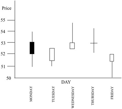
Here is the same stock in the same week with the same information as the bar chart shown in candlestick form –
There’s some jargon associated with candlestick charts. The rectangular part of the symbol is called the ‘real body’. The lines above and below the real body are called the shadows or wicks. Overall, the shape is often reminiscent of a candle, with the shadow being the wick, hence the name. The names candlestick charts and candle charts are used interchangeably.
The way candles are drawn (and this will be done automatically for you by your charting software), is that the real body stretches between the opening and closing prices. Immediately, it is easier to see where these are compared to looking for the little tics. The shadows extend out to the highest and lowest prices of the day, and that is similar to the bar chart. Compare this chart to the previous bar chart to see how that works.
The clever part about candlestick charting, however, is how you can tell which is the opening price and which the closing. If the close is higher than the open, an up day, then the real body is one color, usually white (above) or green; if the close is lower, then the real body is another color, usually black (above) or red. So both the open and close prices are easily seen, and you know in which direction the stock price has headed over the day. Your trading software allows you to set your own preference for colors.
Looking at the example chart, you can see that the price was headed down on Monday, and went up over the day on Tuesday, Wednesday, and Friday. Using colors or shading for the real body gives you a feel for the sympathy of the market. Thursday is a special case with the open and close prices being the same, which means the real body becomes a single line. This is called a Doji in candlestick jargon, and often has some significance for the trader, as it’s said to represent indecision in the market with neither the buyers nor sellers finishing up winning control. Sometimes this means that the trend is about to reverse.
In a similar way to bar charts, a candlestick chart can be used to help you identify trends. If the price of a stock rose during the period under consideration, then investors were bullish about the stock. If the price lost ground during the period, then investors and speculators were bearish. Both bar charts and candlesticks are highly popular and both provide plenty of detailed identical information. However, some people tend to feel that candlesticks make it easier to read charts at a glance, especially in cases where there has been a considerable overall price shift between the open and close and whether the entire period’s trading has been within narrow or broad trading confines.
Candlesticks can help finding existing trends, and determining when the trend has changed, and when a trader should enter or exit. With a stop loss in place, you do not risk a huge amount of your capital. A few small losses should be acceptable.
Because, when you ride a trend, and you are in early, the profits in the trend will more than make up for your losses. The time frame, which you decide on trading, depends totally on your temperament. People use technical analysis on five minutes to hourly to daily to weekly charts and so on.
There’ll be lots more about candlestick charting in Module 8. There are hundreds of patterns associated with candlesticks, with 2, 3 or more candlesticks in succession, and each has been assigned a meaning. In practice, you probably wouldn’t expect to know more than a dozen of the patterns, and I’ll cover the important ones in that module. They provide some strong indications of the direction of the market, but even Steve Nison warns against trading on the basis of candlestick patterns alone. You should always have another indication in favor of the trade before committing to it.