
Equivolume Charting
Richard Arms was also responsible for creating a form of charting called the equivolume chart. If you remember, in module 8 we looked at candle volume charts, where the fatness of the candle body was proportional to the volume traded. In 1983, before candlestick charting had been introduced to the Western trader, Arms wrote about equivolume charting, a similar idea to the later candle volume charts.
The equivolume chart is created by drawing a rectangle for each day or other time period. The rectangle is the height of the day’s trading range, and the width comes from the day’s trading volume. So days with heavy volumes have fat rectangles, and light trading days have narrow rectangles. Here’s an example chart, below the original chart.

Going back to first principles, a higher volume indicates a stronger trend, and light volume may mean not much support for the current move. For a normal bullish price breakout, you can expect to see much wider rectangles. If you are in an uptrend, you can expect the down days to be narrower, and not so well supported by the trading.
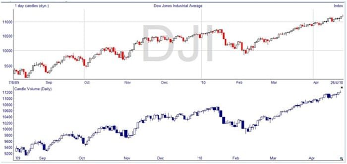
The interesting thing about the Dow Jones Industrial Average shown above is that the retracements in what is ostensibly an uptrend are showing much greater volume. The in trend advances look much lighter, and this is not what would be expected. In fact, this is a reflection of the current market state, where the stock market recovery appears unsupported by fundamental reasons, with soaring national debt, around 10% unemployment, and continued housing and foreclosure issues. As many industry pundits have pointed out, the stock market looks like a treacherous place to be invested for the long-term at the moment, and there are repeated calls that another crash or adjustment is imminent. This chart suggests that the recovery is not as solid as everyone may hope.
Here’s the candle volume chart for the same period, giving very similar information, but with the addition of open and close prices, and the possibility of spotting candlestick reversal patterns.
These were developed by Greg Morris, one of the early candlesticks gurus, who in 1990 proposed combining Japanese candlestick charting with Arm’s equivolume charting. He originally called this combination CandlePower charting, but the name candle volume has now stuck.